CALLING ALL WEB DESIGNERS!

GrapeShow is built and ready for beta testing, with only one minor drawback…

IT HAS NO SKIN!

Other than a logo, the sign-up page, and some other basic pages, it lacks any decent CSS style whatsoever. This is a bit backwards for me, but brains were scattered and deadlines had to be met, so what are ya gonna do?

It seems as though a second wind has surfaced, because I’ve decided to throw a web design contest! So buckle up because it’s about to get very interesting around here. What better way to kick off a video contest app than to have a kick-ass design contest? I can picture it now…

Awesome designers from across the globe submitting U.I. samples; amused visitors voting for the winner and providing feedback; Zack sitting in his cube feeling like he may actually have something to live for.

It gives me goosebumps just thinking about it. From this day forward, the contest shall be known as Grape Skin.

So what’s in it for the winner, you ask? Well in addition to a great publicity opportunity to show off their talent and receive feedback from the public, I’m also prepared to offer 20% of all future profits earned by GrapeShow! Here’s a banner that the talented Lakira made for the contest:

Grape Skin Banner

Do you need cheap server?

The designers will be provided with “chicken-scratch” sketches of some of the U.I. screens to work their magic on and the public will choose the winner. More details about the contest (including rules, start date, and duration) will be released after sufficient interest is received. Designers and other interested parties are encouraged to sign up to participate or vote in the contest.

In addition, if you are a talented developer, entrepreneur, copywriter, marketer, reporter, angel, potential sponsor, or just interested in the project and want to get involved or provide feedback, I would of course love to hear from you as well.

You can all reach me by leaving a comment on this blog or sending an email to: zackjenks@gmail.com. I look forward to hearing from you.

Home Page Design

As you may recall, I hired the talented Scott Wills to design the logo and U.I. for me. He did a great job on the logo and sign-up page and he tolerated my obsessive-compulsive tendencies quite well. Regretfully, I was unable to continue on with the project and we had to go our separate ways.

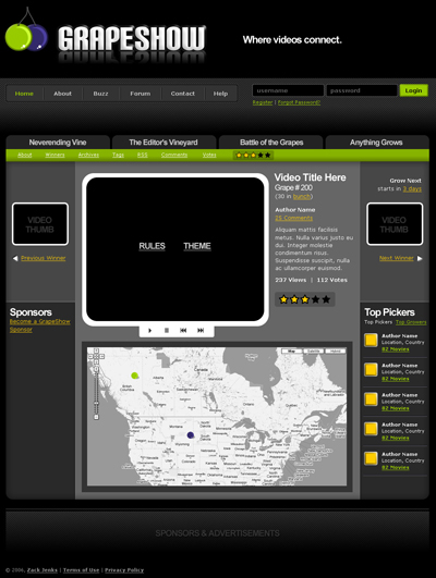
To give you a better idea of what GrapeShow is all about, I would like to present to you now, where we left off with the Home Page design. Thanks for your help on this Scott, it rocks!

Curtains Please…

1. Alternate Header (Click To Enlarge)
GrapeShow Header

2. Home Page (Click To Enlarge)
GrapeShow Home Page

The Almighty Logo

Your appetizer is served…

GrapeShow Logo

Well the sign-up page is anyhow and it’s pretty exciting! Feel free to sign-up to be first notified on launch day.

So, what do you think? I’m very pleased with how this turned out and I want to congratulate Scott on a job well done. And, now you know the name, any idea what it is? I’m a bit curious myself. Some sort of social networking application for drunken wino’s perhaps?

Who knows, but progress is definitely being made I can tell you that, and I’ll be briefing you all shortly with more details. Just wanted to get the logo and sign-up page on here for you guys to check out.

Have a grape day! (Ouch)

The Designer

Behold, my trusty designer Scott Wills. It’s now official and I am thrilled to have him on board. He brings a great amount of experience, creativity and enthusiasm to the table and we’re both anxious to get a move on. So contracts have been signed, initial installment has been made, and design has commenced. He’s working on the logo as we speak in fact, and hopes to have something to show me later on in the week.

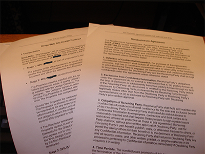
Design Contract and Non-Disclosure Agreement
In addition to the contract, Scott has agreed to sign (and actually took the liberty of drafting) a non-disclosure agreement. It’s not that I don’t trust him, it’s just that I am a paranoid person with an idea that could very easily be copied and I feel better having an agreement in place. Idea secrecy may not always be the best approach, as explained here, but this project is relatively low-risk and I have a good feedback network of close family providing honest criticism. Plus, its how paranoid freaks like me roll. Just ask Harvey Danger

Paranoia paranoia!
Everybody’s coming to get me,
Just say you never met me,
I’m runnin’ underground with the moles,
(Digging holes)

I don’t think I have it quite that bad though. So as I was saying, the designer has been sworn to secrecy and has endured a series of lie detector exams, torture endurance tests, and other CIA tactics that I have made up. He’s been surprisingly cooperative and even seems to respond well to the self-destructing emails I send him (zing, watch out for that one folks)! Seriously though, I know we’re going to make a great team. Yesterday, I briefed him on the appetizer idea and he feels he has enough information to begin branding.

Here is some of the design specs I have given him (excluding idea specific info):

This is a fun and entertaining app so I’d like something creative, new, and exciting [in a logo]. Something that will outlive fads. “Simple, Clean, Crisp, Shiny, Fresh, Fun, Abstract” would be good words to describe the logo in my mind. Simple with an edge, if that even makes sense. I really like the design work done on cork’d.com.

And here is our current plan of action:

As you said, I would expect us to get the branding out of the way first and then move on to layout and page design. I also have sketches of the basic components on each page, and I will get those to you when we get to that point. Of course, these will just be there to give you an idea of components, not as a design/layout reference. You will have creative control to move things around as you like and we can go from there.

Scott and I have agreed to the following payment plan: 40% up front, 40% on delivery, and 20% on go live. As I mentioned he received the initial 40% yesterday so the design work is all systems go at this point. There’s no turning back now!

Designer Wanted

me and prototype
me and my prototype

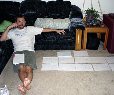
Hear ye hear ye, the appetizer has been prototyped! Well on paper at least. I spent all day yesterday and today designing it, naming it, and copywriting it. My wonderful girlfriend Misty user tested it for me this morning and after some minor tweaks, we both agreed that it’s looking pretty darn good. I had her point to something when she wanted to click and then I gave her the next page, in case you’re wondering. She did an awesome job and uncovered some things I hadn’t thought of. So now all that’s left is to actually build the thing! I also need to find a good designer to build me a logo and some miscellaneous images. I just posted the following on ProgrammerMeetDesigner

I am building a web application and looking for an experienced designer to build approximately 5 vector images. I am hoping to have this completed by the end of the month and it would consist of the following (its grape related btw)…

1 Logo
1 Grape Icon (different from logo)
2 Vine Images (1 HR, 1 Arrow)
1 Larger image of a grape bundle

I want these to represent something new and exciting so am looking for a high level of creativity. The images would need to be fun, simple, clean, crisp, colorful, and in the spirit of web 2.0 ;). I know it’s a term that is way overused these days, but hey.

If this sounds like a good project for you, please respond with an estimate, portfolio, and a little about you and how you typically work with your customers to arrive at a final product. You can reach me here or at zackdad@gmail.com.

Hopefully I’ll have a designer on the payroll by Friday and can get those images within the next few weeks. Everything is coming together nicely so far and it’s on track to be delivered by the end of the month, so stay tuned.

The End of The Beginning

So, where am I at with this thing? Well, I set up this blog for starters. And, I think that’s as far as I’m willing to go. I’m scared to death.

The End!

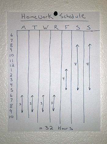
Actually, it’s moving along quite nicely. My “homework schedule” is now posted in the home “office”.

I feel like I’m back at college. One of the hardest thing has been cutting out TV, but I think I’ll be alright once the shakes subside. Oh crap, the SEASON FINALE of Hell’s Kitchen is on! Where’s the remote? This is not a drill people! To be continued…

Alright, where was I? Oh right, let me fill you in on what I’ve done as far as setting up this blog and beginning the marketing process. This blog serves as a marketing tool for my business, so let me briefly talk about how I set it up. First of all, it is a WordPress blog that I installed on my web server at home. Something Ventured is a title that I felt nicely embodied what it is I am doing. As always though, whenever I think I’m being original, there’s a million people out there thinking the same thing. When I tried to register the name at GoDaddy I discovered there’s already a “somethingventured.com” out there.

As I did a little more investigating, there are tons of sites out there using this phrase. Go figure. I’m unique and original just like everybody else, right? So I tried a few others and finally settled on someventure. I think it works, what do you think? It’s all in how you read it. If you have a half-full glass, it’s “wow, that’s SOME venture you got there!”. If your glass is half empty, it’s “neh, that’s just some venture, who cares”. Or maybe you happen to be drinking a quadruple shot latte or mixed drink and it’s “hey man…some [people] venture…think about it?”. However you read it, it’s a done deal, and I am now officially financially invested in this puppy. A whopping $9.20 too!

Now, the next order of business is how to market my marketing tool. For starters, I setup an RSS News Feed (top right, if you haven’t already subscribed) to run through the all powerful FeedBurner, so I can monitor usage and enhance/promote the feed. I then setup an account with Google Analytics to help me measure traffic to this site. And the first wave of marketing is underway. The search engines are probably crawling as we speak, as I submitted the domain to Open Directory, Google, Yahoo, and other free directories. I linked to it from a few others sites that I own as well as blog search engines Technorati, Weblogs, and BlogSearchEngine. It’s been added to my list of del.icio.us links and I’m hoping others will follow suit (wink). If you use Technorati and want to add this blog to your profile, I added a link in my sidebar just for you.

So, my plan from here is to start participating more in other peoples blogs and get the word out that way. I am also considering posting links in MySpace and other social networking sites. And if you’ve ever heard of the game SecondLife – I may do some advertising there as well. I’ll keep you updated on how my marketing efforts are paying off and new tools I find along the way. If you have any good tips, please comment.

Misty

My lovely and talented girlfriend Misty helped me out with the logo. Although she’ll probably never help me again because I was such a pain in the process, right Misty? Misty? Huh, that’s odd, there’s just a note where all her stuff used to be?